
经常会遇到这样的排列布局,要求实现一行三个,显示多行,左对齐,思考片刻决定使用 flex 布局。
最终效果图:
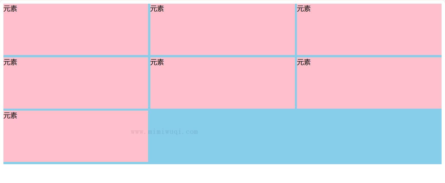
代码如下:
<body>
    <section >
        <div >元素</div>
        <div >元素</div>
        <div >元素</div>
        <div >元素</div>
        <div >元素</div>
        <div >元素</div>
        <div >元素</div>
    </section>
</body>
<style>
    .content {
        width: 100%;
        display: flex;
        flex-wrap: wrap;
        background-color: skyblue;
    }
    .item {
        flex: 0 0 calc((100% - 10px)/3);
        height: 120px;
        background-color: pink;
        /* 间隙为 5px */
        margin: 0 5px 5px 0;
    }
    .item:nth-child(3n) {
        /* 去除第 3n 个的 margin-right */
        margin-right: 0;
    }
</style>
也可以:
.item {
    /* flex: 0 0 calc((100% - 10px)/3); */
    width: calc((100% - 10px) / 3);
    height: 120px;
    background-color: pink;
    /* 间隙为 5px */
    margin: 0 5px 5px 0;
}
至此使用 flex 布局完美解决一行三个,显示多行,左对齐的需求。